UX Critique Challenge
Recently I was asked to name a site that demonstrated good UI/UX, a site that could be improved, and a site with poor navigation and how I would fix it. Here is my response.
------------
I found a link to an article on Hacker News one day, and thought “wow, this design is awesome” (the content was solid too). This was the first time I saw svbtle. It is an invite-only publishing platform that allows a select few to display their writing. It’s somewhere between a blog and a magazine. The content is top-notch, but the design is what really drew me in.
The first thing you notice is the minimalism. There is a lot of white space, and color is sparsely used. But it’s used well. Mostly they’re used in icons. I love the icons because they are very simple: a rocket ship, a hat, a turntable, a pencil, etc. I like this because it forces the each author to think carefully, and be very creative in choosing an image/color combination that represents them.

Each blog title changes color on hover to match the color of the icon. This is a small thing, but it makes me smile. It allows for some individuality and differentiation, despite the simple design style. You’ll notice that much of the rest of the color on this site occurs on hover actions. I think this is great. When you first see the site, you notice that it is black and grey text on a white background. The color is sparse, but it’s just enough to make the site playful. All the hover actions reward the user for exploring. It encourages users to look around.
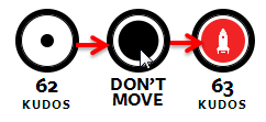
Perhaps the best example of this is on an individual post page. Instead of ‘liking’ a post, you give it ‘kudos.’ A clever bit of jquery fills a circle when you hover. When the circle completely fills, it adds a kudos, updates the total, and displays the author’s icon. This may not seem any different than a Facebook like, but to me, the kudos is not as trivial. It’s more engaging, and it makes the reader feel more involved in the process. Plus it’s really cool.
Recently I helped produce the Ann Arbor chapter of World IA Day. Although the talks focused on information architecture, there is, of course, a great deal of overlap with user experience. One of the key takeaways for me was that great design is important, but it doesn’t matter if the content isn’t there. More importantly, one thing that makes a design great is that it is designed from the content. The design reflects an understanding of how and why people will use the site, and facilitates that experience. I believe this is what svbtle does. The design is very pretty and quite clever. But it doesn’t get in the way of the content. It signals that the content is sharp and smart, and stays out of the way so you can consume.
------------
This brings me to iTunes Preview. I think Apple really has a horrible way of purchasing/installing apps. First of all, I often do some research before I install. I don’t want to waste my time installing a bad app, and I certainly don’t want to waste money buying something that is bad. The best way to do this is by far through the web. It is much easier and faster to research apps online when you can have multiple tabs open and compare them side-by-side.
So, if you search for an app online you end up at the iTunes Preview site. If you decided you want to install or buy the app, you have to either load it on your phone or open up iTunes. Why can’t I install directly from the browser? Google does it. Microsoft does it. Apple doesn't have to think different here. The web method provides a vastly better experience because it's a faster, more streamlined process, and it gives us the option to use the system as we choose.

Disregarding that, there are several other reasons Apple should be ashamed of iTunes Preview. One is that the text is a horrible color. There is nothing inherently wrong with a light grey text, but placing it on a white background is not so great. On some displays it can be hard to read because of the low contrast. I’m sure this site doesn’t do too well with meeting accessibility standards, as it doesn’t even pass the WCAG contrast ratio recommendations. Because of this color scheme, there is nothing salient on the page. While all of the relevant information is above the fold, it is difficult to discern where it is. For example, Google’s store has the star ratings in blue, to contrast the grey text. Apple has everything the same color and same shade of grey.

Similarly, the data is just not very well organized. Take the requirements section. This is meant to be informative and helpful for users to figure out if the app is compatible with their device. However, it’s one big block of text, and very difficult to quickly determine if you’re good to go. If you’re signed in, Google will tell you if the app is compatible, so you don’t have to do any thinking. Even if you’re not signed in, Google tells you that all devices over a certain OS version will work. While this requires more initial knowledge, it reduces the cognitive load for the user when on the site.

There is also the customer reviews section. iTunes Preview only shows three reviews. This is despite the fact that you can easily see that there are many more ratings, and thus likely many more reviews. It does not tell you how these three were selected. Are they the most helpful ones, the most recent, or just a few random ones? How can you tell if they are representative? Again, Google does this much better. They show you three reviews, but allow you to access the rest of the reviews, which you can then sort by helpfulness or date. Google also shows you the distribution of reviews, which is quite helpful, as well.
------------
Finally, I’d like to discuss Auxiliary Design Co. I think they have a beautiful site. The design is refreshingly different from most of what’s out there. It’s one large canvas that moves the focus around from anchor to anchor depending on what content you want to see (think Prezi). It’s similar to the single page trend, expect that it uses horizontal space as well. The big problem is that you can only navigate by clicking the links within the nav bar. You can’t scroll and you can’t drag. Although I know I must click on each link in the nav bar, I still find myself trying to scroll and clicking to try to drag. Obviously scrolling is much more of a natural reaction, but because of the canvas layout, I think there is also an affordance to dragging. At least for me there is the instinct to drag the page around. Either way, this is a poor user experience because the navigation is so frustrating. It's frustrating because it is otherwise a wonderful design.

For example, if you’re on the Twitter section, you can just see some of the About section below (dependent on screen size and resolution, of course). Similar to Microsoft’s Zune/Metro theme, the cutoff shows you that there is more. However, unlike Metro, you can’t just scroll/swipe over. You have to go back up to the nav bar and click on the link. This isn’t necessarily a huge problem, but it goes against human behavior. If we see something sticking out, our natural instinct is to pull it out to see what it is. In some ways, this is like a Rube Goldberg machine. The simplest, easiest, and most natural way to move is to scroll. Why should we have to move the mouse all the way to the top left? If you make a user do something that is unnatural, you must be able to justify it. I can't see a reason why scrolling isn't an available option to navigate the page.
It can be fixed by changing the way the navigation works. I think the simplest thing would be to disable the overflow css properties so that scrolling works. The nav bar could still be there if anyone wanted to use it, but they now have the option of scrolling. This would suffice, but I would also consider adding some javascript to be able to drag the page. I admit that it may not be totally practical, but it’s really cool, and fits in well, considering the goal of this site is to impress.